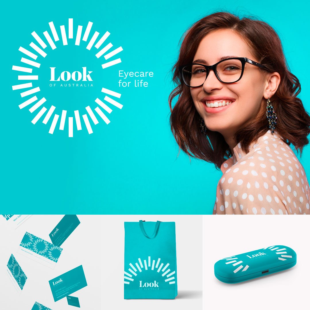
Look of Australia
‘Look of Australia’ was established in 1995 as an optometrist in the heart of Hobart, Tasmania. The business started vibrantly in the 90’s and was sold to the current owners in 2017.

Look of Australia
Branding
Creative
Design
Packaging
Strategy
Brief
After twenty-two years, Look of Australia’s average consumers age was 65 and despite radio & print advertising, new business was waning. The new owners wanted a fresh and vibrant business that tailored to a younger generation and families as well as existing consumers. Recognizing this, they decided that the brand required a refresh in order to achieve their goals.
Research
Jackett visited Tasmania and undertook a thorough business & brand analysis. After interviewing staff & the new owners, Jackett conducted an extensive competitor analysis and SWOT. Market research was also conducted. Information was compiled and shared back to LOA before conceptual design and TOV was formally presented.
Design
Jackett designed an optometrists brand unique to the Tasmanian market. Capitalising on LOA’s strengths, Jackett utilised a classic bold serif font (addressing legacy & strength in industry) combined with more contemporary sans serif script, a unique to market colour scheme and striking informal photography. Equally important, a newly established Tone Of Voice (TOV) and Jackett’s recommended strap-line of ‘Eyecare for Life’ dovetail into the revised look and feel, establishing an emotive link between business goals, internal induction and training (swapping out the ‘Eye’ for ‘I care for life’) and the prospective marketplace.
The refreshed brand capitalises on the business’s strengths in customer service, longevity and cutting edge technological infrastructure & know-how while speaking to targeted customer profiles.